

Interior Design: The Effects of Colors on Emotions
Interior Design Colors
Think about the way you feel on a dark and cloudy day. Or the way you feel during the winter when the trees lose their brightly colored leaves or even the way springtime brings an abundance of color and an abundance of happiness. The way our emotions can change along with the seasons is a testament to the profound effect that color can have on your mood. Colors have the power to evoke certain emotions and can even bring about memories of past experiences, both good and bad. People wear black to funerals and white to weddings for a reason; color is a powerful emotional tool that can help you to express yourself in many ways.
The way you use color in your home can say a lot about you and the kind of experience you are trying to create. What do your color choices make your guests feel like when they enter and, more importantly, how do the colors you use in your home make you feel? Color is a universal language that you may not know how to speak. It’s a powerful design tool that you can use to set the scene in your home, but just what do colors mean and how can you use them to create an atmosphere that you are proud to call your own?
Red Emotions: The Color of Passion

Red is a bold color that brings about feelings of passion and excitement. Using red in your home is a sure fire way to make a statement. Since red is associated with excitement and passion, it’s known to raise the heart rate and stimulate blood flow. It’s definitely a color that you will want to reserve, at least in large amounts, for common areas like kitchens, bedrooms and living rooms. Using too much red in the bedroom can be over-stimulating, both to the body and to the mind, interfering with sleep and relaxation. Red is bold and intense and can be an uplifting and invigorating color when used the right way. It’s also been known to stimulate appetite, making it a great choice for kitchens!
Blue Emotions: A Mellow Mood
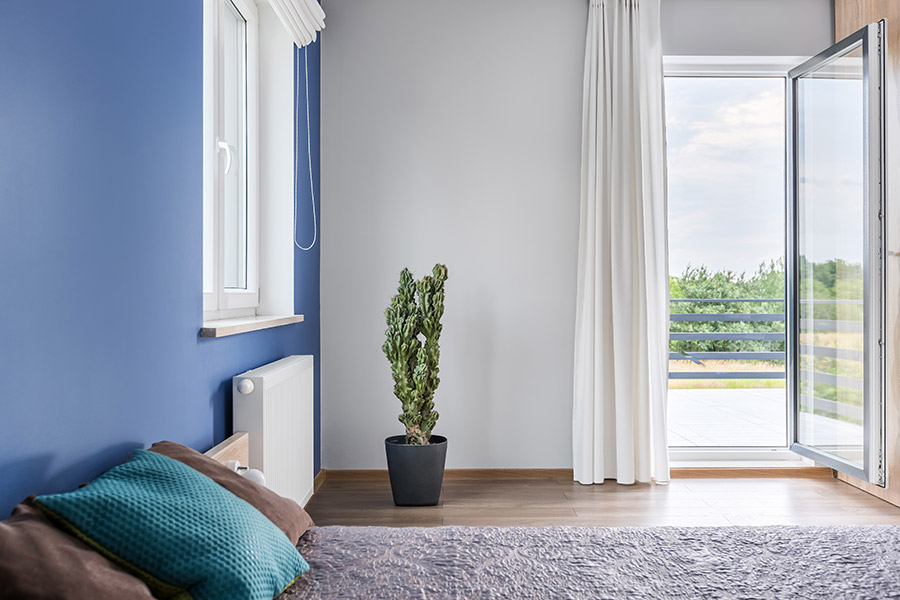
Blue is a calming color. It’s often associated with peace and tranquility. Unlike the color red which can actually stimulate you, blue can have the opposite affect on your body. You can use blue in the home to make your guests feel at ease. It’s wonderful to use in bedrooms to bring about a sense of calmness, especially at night. Be sure to use a light or bright shade of blue like periwinkle or turquoise, as dark blue tends to be associated with feelings of sadness, an emotion that you definitely don’t want to associate with your home.
Yellow Emotions: Let in the Sunshine

Yellow is the color of joy, positivity and creativity. It’s an uplifting color that can have an energizing effect and bring about feelings of happiness. It’s an attention grabbing color that is perfect to use if you are trying to draw the eye to a certain area of a room. It’s perfect as an accent color or as a way to make a statement in your main color scheme. Plus, bright colors like yellow help to create the illusion of space, so it’s a great choice for small spaces!
Green Emotions: Maintain Balance
Green is the color of harmony, balance and rest. It’s easy on the eye, meaning the eyes do not have to make any adjustments in order to process the color. This means that it’s a wonderful color to use to encourage rest and regeneration in the home. Green is also the color of concentration, which means it’s an excellent color to use in a home office or workspace. Of course, green is also associated with nature and the outdoors, so it can easily lend a natural feel to your home.
Purple Emotions: The Royal Experience

Purple, especially the darker shades, is the color of elegance and luxury. It can help to bring a pop of creativity and depth (both physically and intellectually) to your home. Purple is often associated with royalty, which makes it the perfect color to use to bring a touch of sophistication to any room. The lighter shades of purple, like lilac and violet, bring about a similar restful and relaxed state as blue, which means it’s a great color to use in the bedroom or any place you want to encourage calmness.
White Emotions: A Simplistic Approach
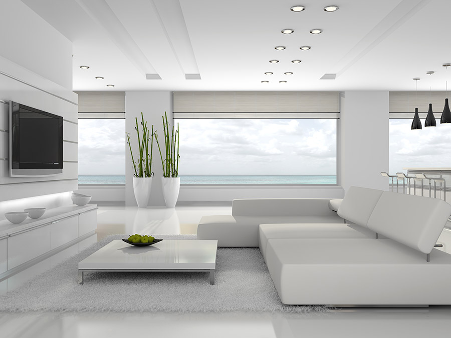
When we think of white, we think of cleanliness and purity. It’s the color of newness and innocence and can make your home feel clean, open and airy. Of course, you would never want to have a completely white room, but using it in small doses or as a base color is sure way to bring about a classic and clean feeling to your home. In fact, this goes for all neutrals. Use them as accents to liven things up, or to calm things down.
As you can see, there is a lot more to using color in your home than meets the eye. It’s a powerful design tool that can play a huge role in both the overall aesthetic and the emotional space created in your home. Be careful and intentional in how you use color and remember to ask yourself what you want your home to say and how your color choices will reflect that message.

No Comments